Richard Tipping: Come in: We're Closed
|
Richard Tipping
Come in - We're closed Subvert I sing RedfoxPress c. $30 from the publisher or contact Richard Tipping at www.artpoem.com |
|
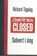
This little book is another in the stimulating A6 C’est mon Dada series from Redfoxpress, based in Achill Island, Ireland. The subtitle suggests a play on advertising and there are a few pieces in the book which ‘subvert’ advertising. It is a mini selected works from Tipping’s output from 1969 through to 2007. The 35 pieces represent a small proportion of the considerable output from the many different genres he excels in. He has created large scale installations and public sculptures which are not featured in this book.
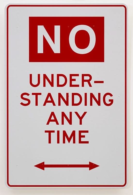
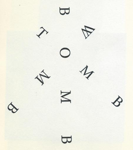
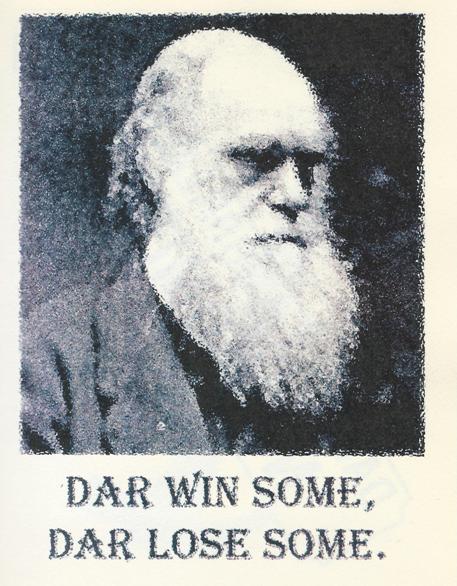
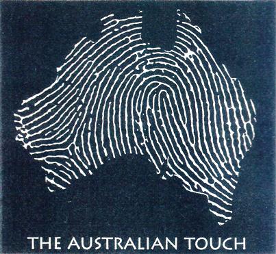
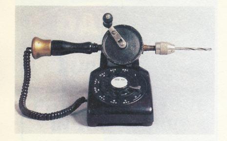
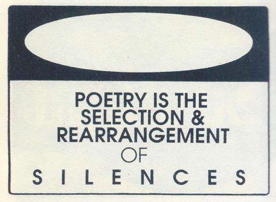
The front and back covers of the book present two contradictory shop signs: Come in We’re closed and Sorry We’re open. Perhaps they are just a comment on shop-keeping. The pretended welcome and bonhomie whose ultimate and ulterior purpose is to extract our money. They date from 2001 and perhaps they are commenting on Australia’s attitude to our ‘boat people’ problem. Perhaps they are a comment on Basil Faulty. I’m not sure of an exact quote but his attitude was definitely expressed as – I could run a great hotel if it wasn’t for the bloody guests! Perhaps they are a comment on signs. Perhaps a comment on the conundrums and contradictions of language when sentences can be grammatically correct but meaningfully impossible – e.g. I will talk to you about this matter yesterday. As we run through the possible interpretations sparked by the unwelcoming signs it is clear that these two three word slogans can uncork a whole crate of literary/artistic champagne. You will find as you allow time to absorb his work that Tipping is usually suggesting multiple layers. His road sign adjustments are well known to those who take an interest in Australian concrete and visual poetry. No under-standing any time is a classic statement of the difficulties we all have with ‘authorities’ – traffic and otherwise. Note the simple pun – we must not stand ‘under’ the sign at any time. Bomb – tomb – womb is a more ‘conventional’ concrete poem in the style of Alan Riddell. In Dar win some – Dar lose some it is hard not to enjoy the witty explanation of evolution not only as a pun joke but also a hard cold fact of the survival and non-survival of species. The internal contradiction of the words in some kind of loose c’est la vie shrug of the shoulders lingo and the serious and sage looking slightly blurred photo of Darwin adds to its appeal. I can’t resist adding the words of Jas H Duke – the species that breed and survive are the species that breed and survive. While Tipping uses words in many of his creations he has also many examples of word free illustrations and objects which evoke the same myriad responses of those with words. The Australian Touch displays a fingerprint pressed onto a map of Australia. The lines resemble ridge lines of deserts, mountains and rivers; they look like the lines on a synoptic chart; they also have a sinister feel of ‘white’ imposing its patterns on ‘black’. The wavy fluid lines suggest an impermanence as well. Our Anglo (and multi-source immigrant) presence is just a brief episode in the aeons of time as the smallest continent arrows its way Northwards. Our presence is a surging wave that will be wiped away just as fingerprints fade away over time. And the word ‘touch’ can have many connotations both positive and negative. It could also be the design of a postage stamp! The hand drill telephone, Drillaphone, obviously suggests the boring in of words from an unwanted caller to a landline telephone; the unwanted telemarketers; or the drill bit slowly boring a hole in your head while you listen to someone you really don’t want to know anymore who keeps ringing you up. The piece also suggests the advances of technology from the iron age of the hand cranked drill to the plastic age of the 70’s telephone. The wire of electric current connects those eras and powers our new communications. Richard Tipping’s varied output is always entertaining, multi-layered, pointed and frequently graceful. Those of us who have enjoyed his work over the years hope for a large well presented, coffee table size book sometime soon. I’d certainly buy one and a few extra for gifts. Until then we have to be content with occasional volumes such as this offering from RedfoxPress. If, as the old saying goes, a picture is worth a thousand words I cannot help wondering the value we can place on word pictures of the kind he produces. I’ll close this notice with one of his more thoughtful and graceful signs about poetry. Contact Richard at www.artpoem.com Contact Redfoxpress at www.redfoxpress.com |
