Ascender/Descender - Derek Beaulieu
|
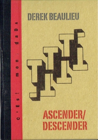
ASCENDER/DESCENDER Derek Beaulieu RedfoxPress $26.50 mailed to Australia |
|
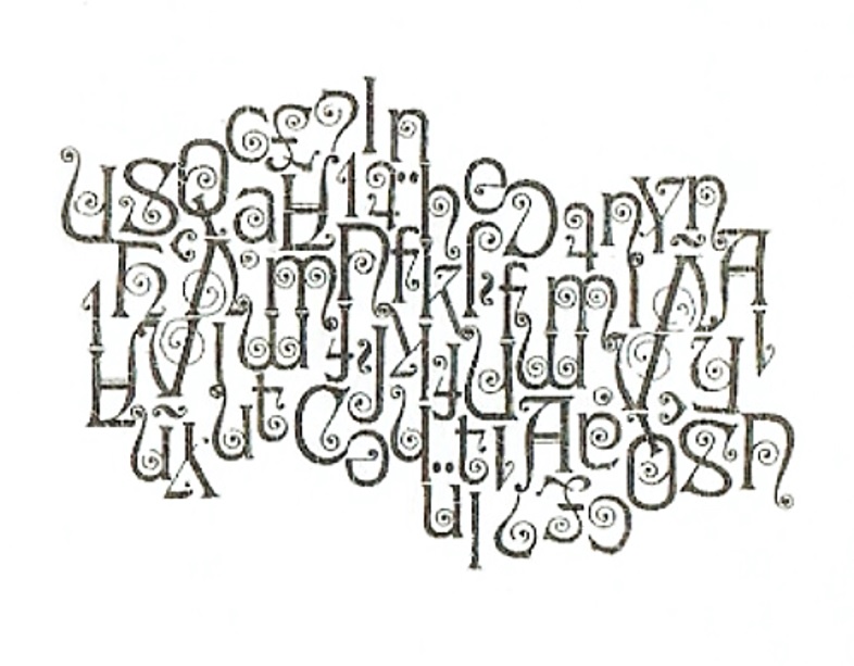
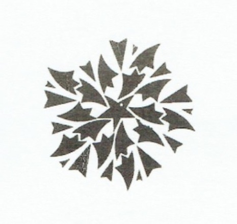
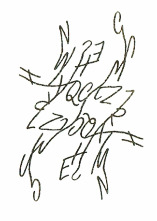
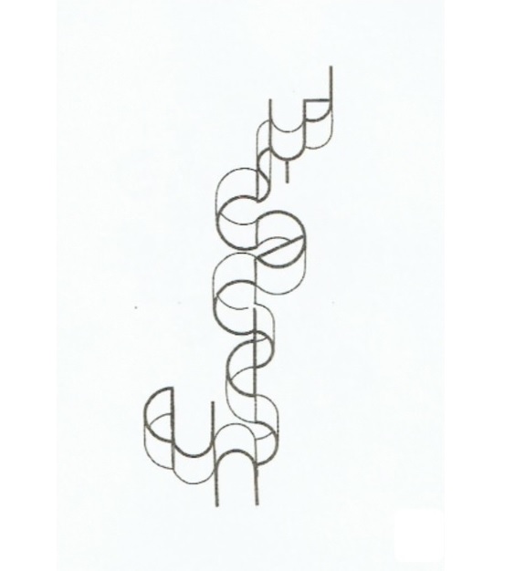
This is another of Redfoxpress’s C’est mon dada series of A5 concrete poetry book(lets) with a total of forty-four pages between cardboard covers. It’s a very attractive little presentation. Inside are forty creations based mainly upon letters and punctuation marks. Examples illustrated will give a better idea of what they are than any verbal description. Beaulieu uses many different artistic typefaces with gusto and abandon. A positive intoxication! There seems to be no rhyme or reason to the selection other than meeting the old criterion: does it work? Does it look good? The answer for the most part is emphatically: yes it does. In some cases, the creations may seem to remain in the realm of decoration rather than rising to art but they are very intriguing decorations. I would love to see some of these pieces (and indeed many concrete poems from many people) enlarged to poster size and gracing the foyers of office towers or the walls of restaurants. I’m sure they’d provide a talking point. Way back in 1974 Time Life International published a book called The Emergence of Man: The birth of writing. I recently picked up a copy for $2 in a bargain bin! The following is from p115: What exactly is the alphabet? Seven different alphabetic scripts are employed today, but all of them rest on a single principle: an alphabet consists of a fixed set of written signs, each standing, in theory at least for, for a single spoken sound; all the signs can be used interchangeably to form the various words of a given language. In practice few fully developed alphabets meet the ideal of one sign per sound; with the passage of time, changes in the way hands shape the signs, the effects of dialect and the voices that speak the words cause script and sounds to evolve along divergent paths. But the principle of a finite number of signs to indicate the sounds of the human voice, no matter what the language is, has remained intact. So how do we reconcile that definition of letters being signs for sounds with all these images of letters being silent. Like good children, concrete poems should be seen and not heard! We can look at some of them as if they were a slab of ancient writing that we haven’t been able to decipher yet. A message here as mysterious as cuneiform before we were able to find its meaning. In the top example, perhaps the first thing you’ll notice is all the eyes looking at you, some in level pairs, some in slightly angled pairs, many single. This piece may look like a design for an iron gate - or a message from an ancient language. Keep looking and you’ll notice that the upper left quadrant is an inversion of the lower right quadrant and the upper right quadrant is inverted on the lower left. In the centre the letters n, h and k line up to form a straight dividing line. Scratch my brain as hard as can be I can find no conventional word meaning. Despite that possible lack there is something entrancing about the result. A similar analysis can be applied to many of these designs. Playing with balance, reflection and inversion occurs throughout the book(let). See the ascending and descending 'T''s on the front cover. What can we make of the second piece? Arrowheads, spear tips, pen nibs, a star in the centre, a spinning saw blade coming apart due to centrifugal force, a family crest: make up your own possibilities. A power source for an alien spaceship? A new selection of dingbats? A graphical representation of the Big Bang? Exam question: Make up twenty interpretations of the attached graphic. Which do you prefer? Why? What do you think the artist had in mind? Much similar interpretation and questioning could be made about of so many of the pieces in this little book(let). I’ll include two more for you to look at that you may surrender to the mind’s teasing or just surrender to the aesthetic delight. More about Derek Beaulieu can be found on the web. If you're new to this concrete poetry business do look him up. The ASCENDER/DESCENDER show is well worth the price of admission. |
|
